© GUCCIMAZE
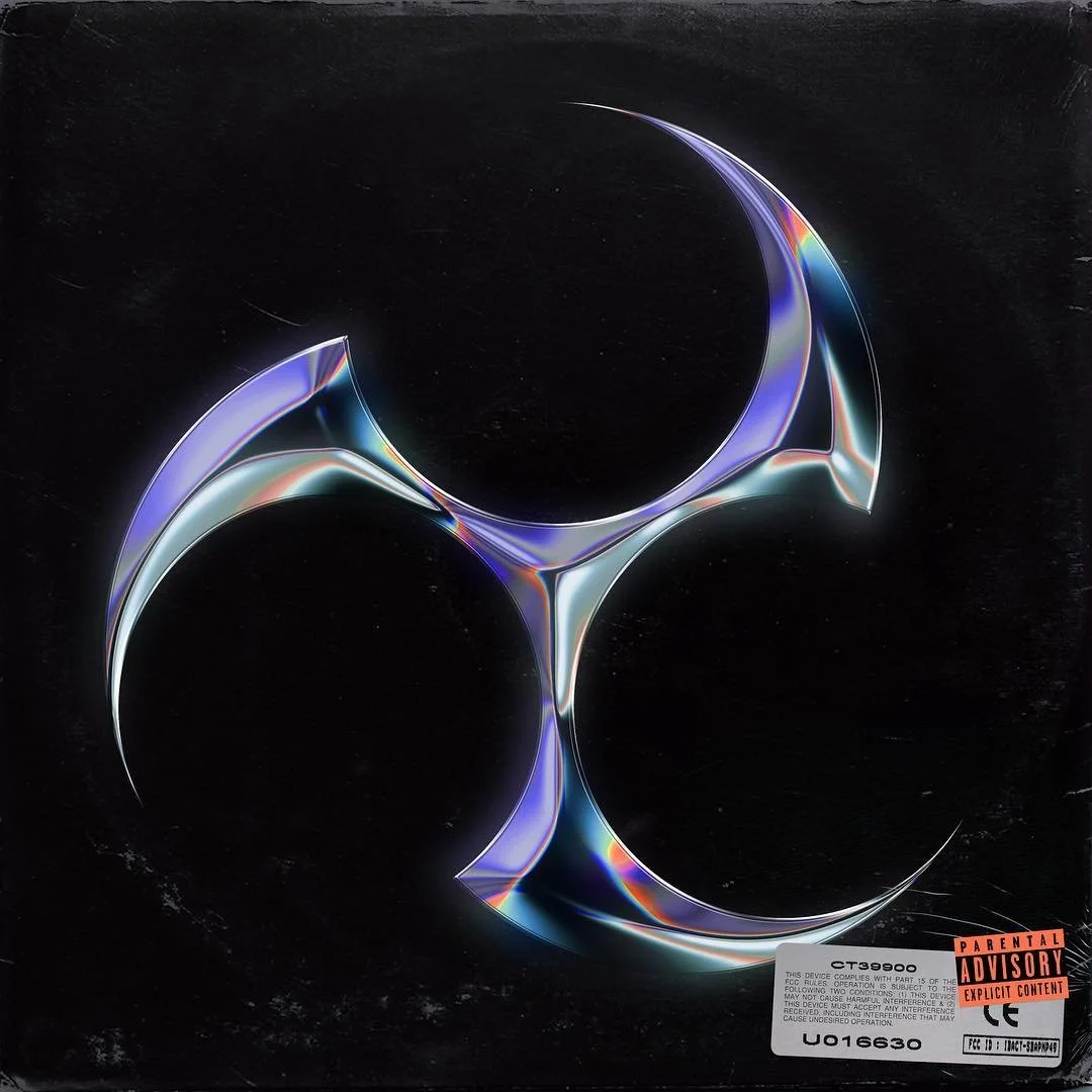
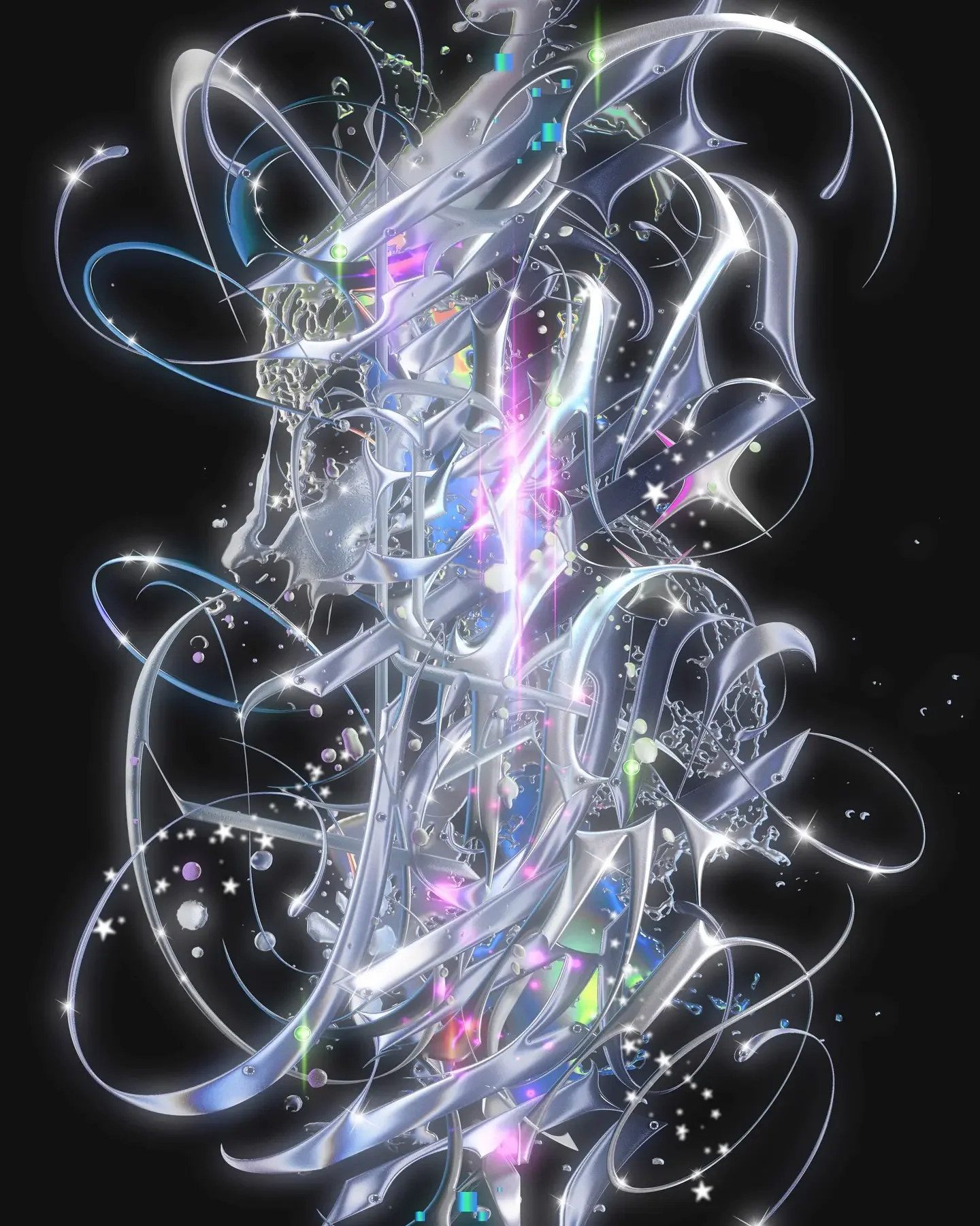
We all know the liquid-metal typography, with its three-dimensional, razor-sharp, and flame-like dripping lettering. Today it’s a design standard, woven as deeply into fashion as it is into graphic design. Looking back a decade, as the heyday of Vaporwave internet culture began crossing over with Y2K aesthetics, tribal tattoos, and graffiti styles, we arrived at what would be summarized as the Chrometype movement. Though GUCCIMAZE doesn’t consider himself a pioneer, he is undoubtedly one of Tokyo’s leading designers in the genre.
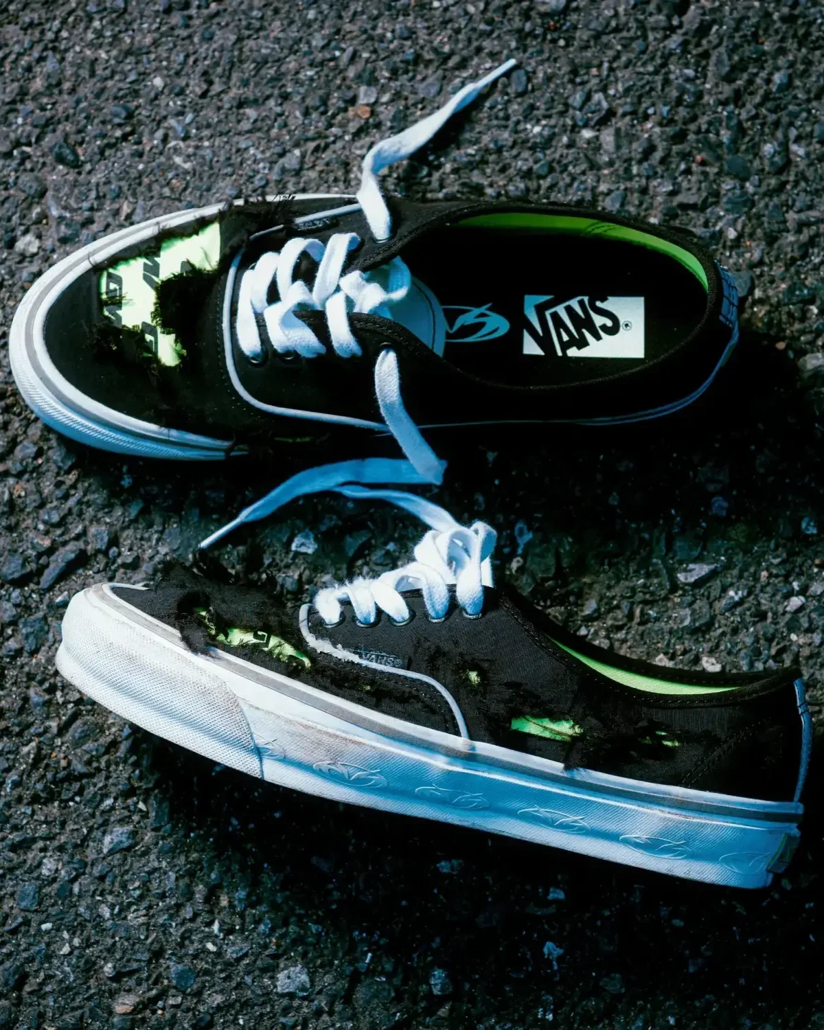
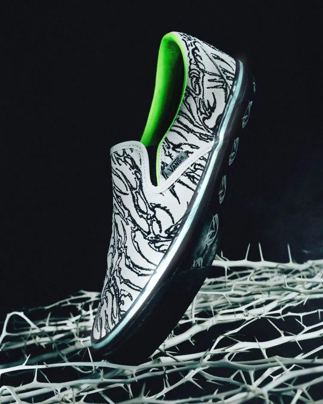
His visual language quickly crossed over to international titans, creating a collaboration graphic for Fred again.. with UNIQLO UTme, working with Nicki Minaj, and dropping a custom collab with Vans.
It’s an aesthetic that feels hyper-digital on the surface, but GUCCIMAZE’s graphic identity is far more analog than you might realize. Almost all of his work begins with a mindset rooted in calligraphy before any pixel is touched on screen. But before we land there, we take a deep dive into the childhood inspirations that shaped the visual brain of one of Japan’s leading creative forces.
© GUCCIMAZE
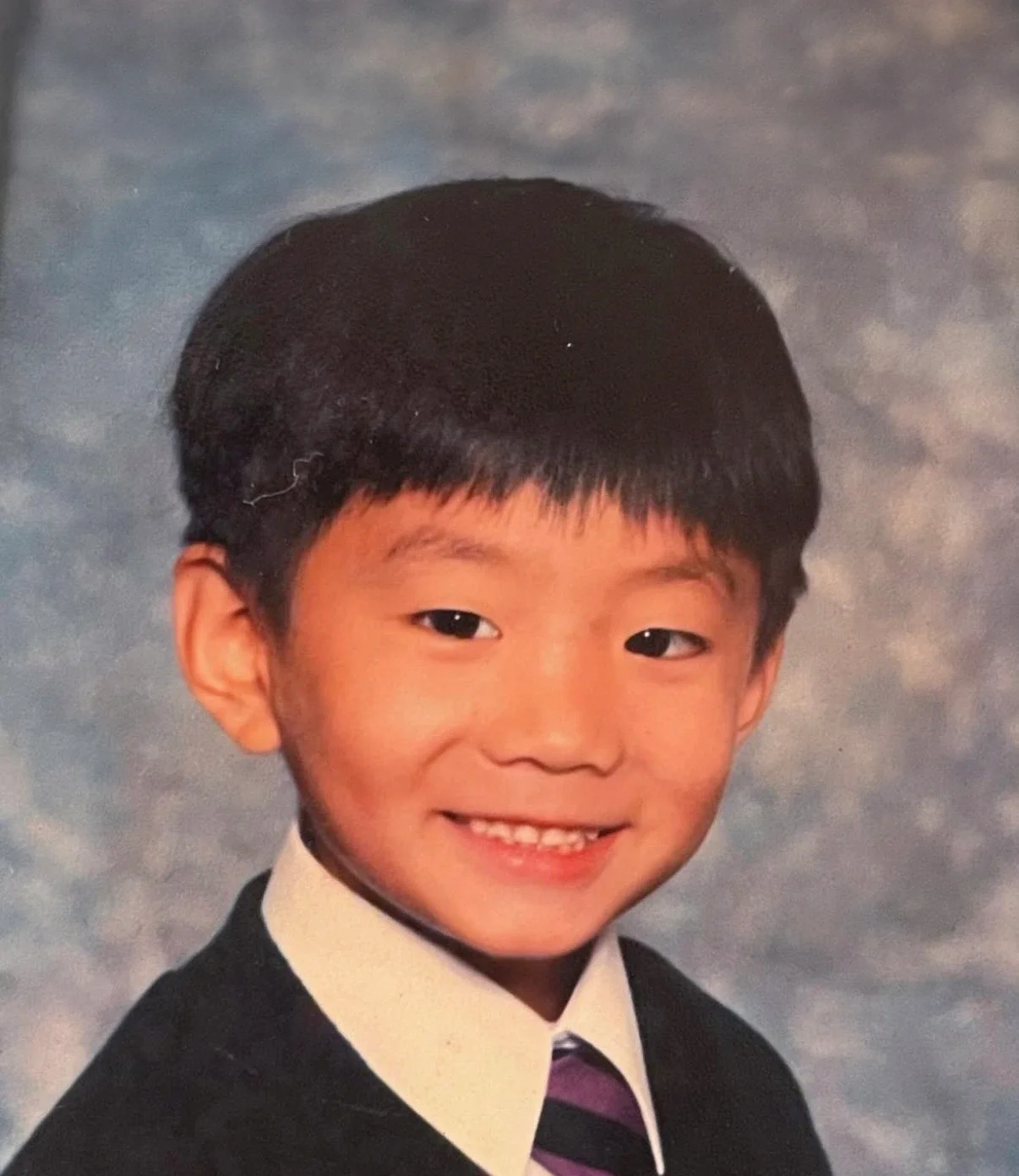
To trace the roots of GUCCIMAZE’s visual brain, we’ll have to bypass Tokyo entirely and look at a kid wandering the streets of London and surfing the beaches of Shonan. It was in London where a young GUCCIMAZE first locked eyes with street art (read: graffiti). After moving back to Japan, he saved up his allowance, sneaked out of his parents' house, bought a green spray can, and went on his own street adventure. Learning graffiti by imitating others, the base of his signature style took root.
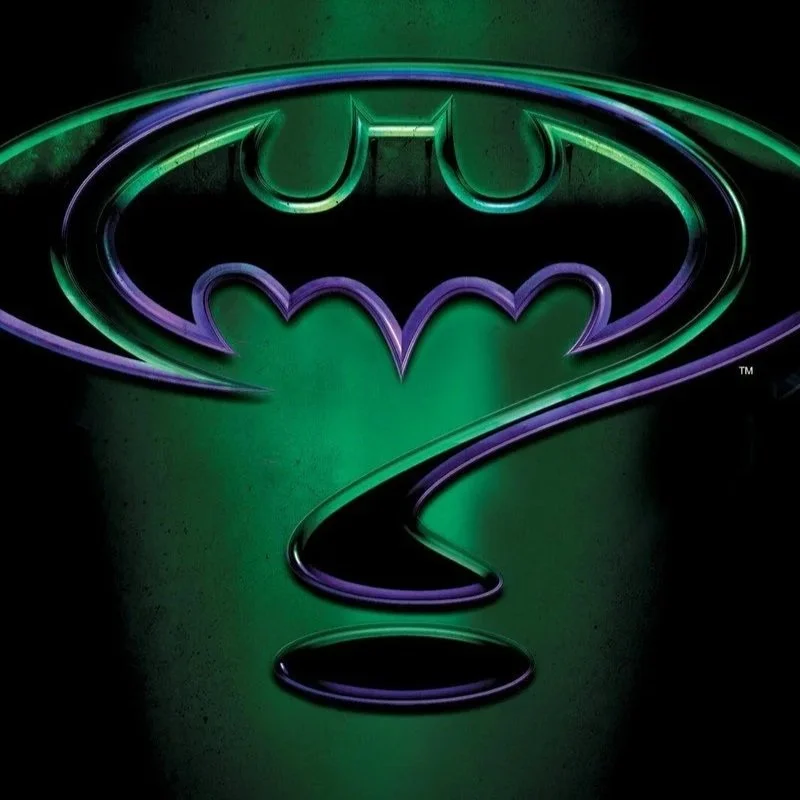
So why start with green? It’s not often that you can trace the visual anchor point of an artist’s style back to one specific piece of media, or in the case of GUCCIMAZE. The first being the 1995 Val Kilmer classic Batman Forever. Although the integrity of the movie’s storyline might be questioned, its neon-soaked, dark greenish art direction was an absolute treat. He has been open about how it played a direct role in the development of his style. Have a rewatch, and you’ll immediately spot why this piece of fiction became such an important visual inspiration for GUCCIMAZE.
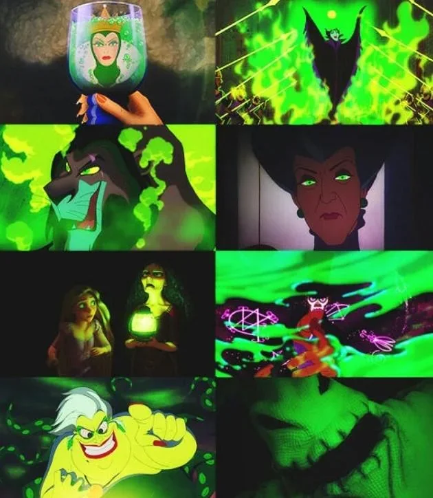
Growing up in London, he often watched Disney movies and started noticing a recurring colour palette in the way their villains were portrayed. If there’s one colour Disney always goes back to when signalling their evil minds, it’s lime green, paired with black, purple, and blue, a combination that became one of the influences on GUCCIMAZE’s own palette.
Another inspiration came to him while watching the Japanese period drama The Unfettered Shogun (暴れん坊将軍), which triggered a fascination with robust movie title cards, hence his interest in calligraphy.
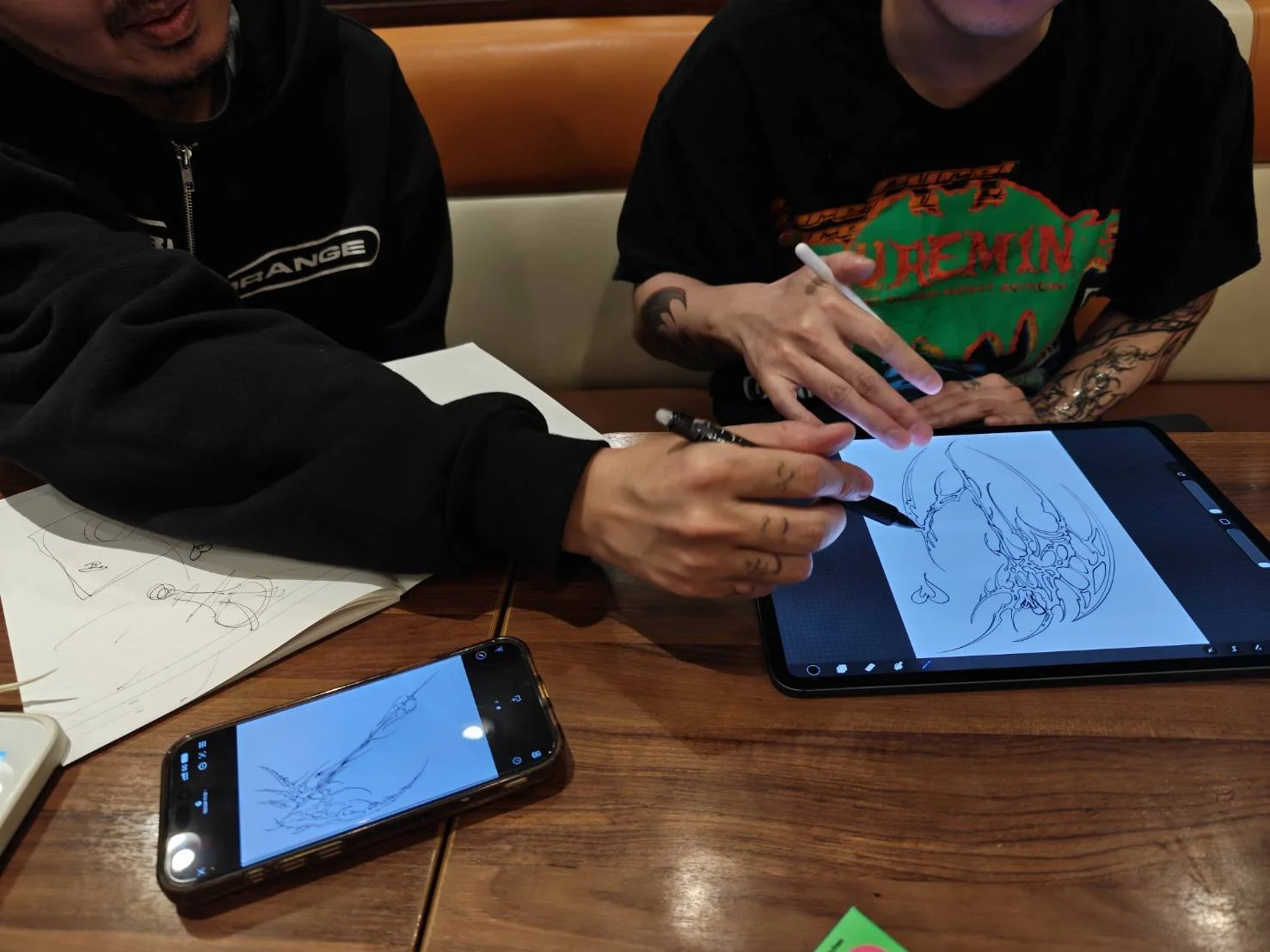
That obsession drove him straight into traditional Shodo (calligraphy) classes, a decision that became the visual cornerstone of his entire career. Step by step, the pieces of what would become GUCCIMAZE’s signature style came together. While many may assume his work is 100% digital, the majority of his pieces still start on paper through the lens of calligraphy, before he digitizes and alters the work on screen.
During his middle and high school years, the Ura-Harajuku fashion boom was reaching its peak. It funneled global hip-hop and skate culture straight to a whole generation of Tokyo's youth, including GUCCIMAZE. Once he entered university, he found his way into Tokyo's nightlife, a scene he's still heavily involved in today.
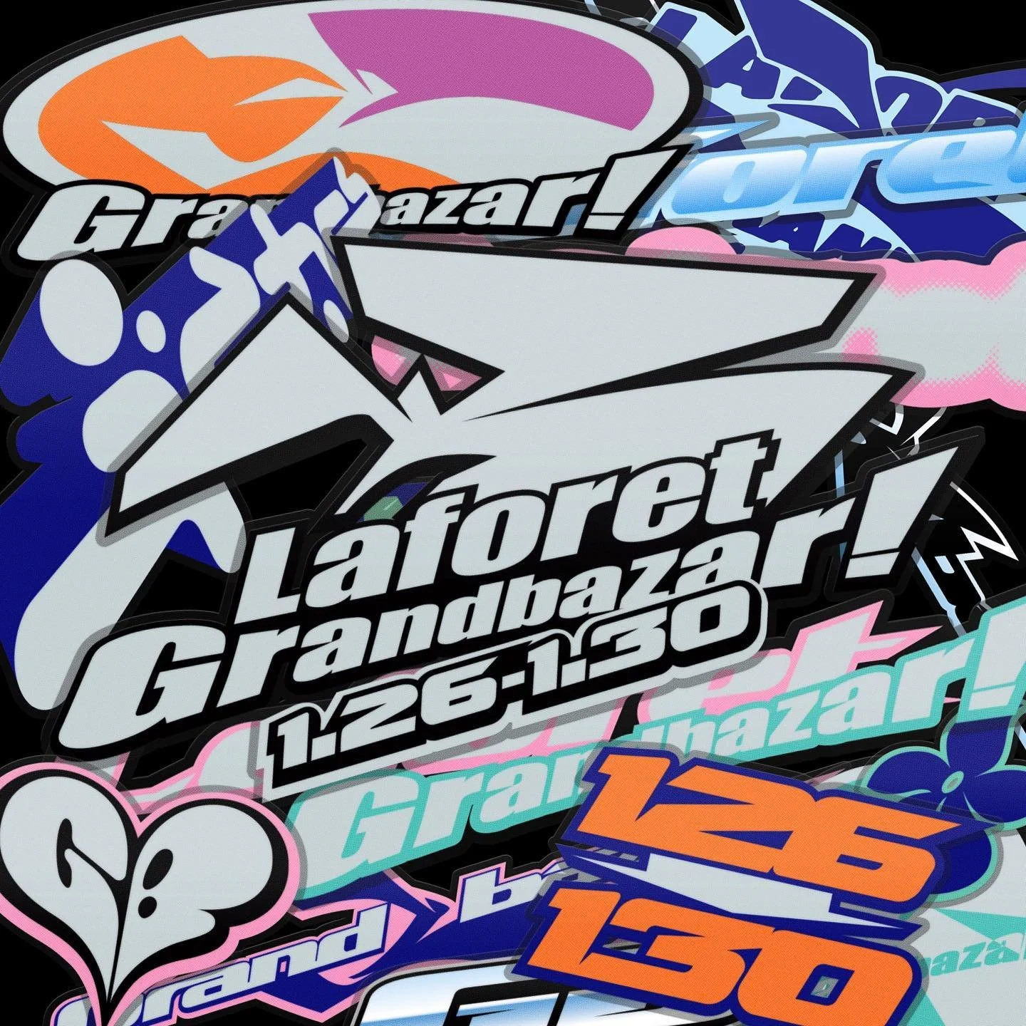
It was after graduating that the alias GUCCIMAZE came into existence. He took a job at a design production agency, which quickly turned out not to be the right path for him. With limited time and a hunger to create, he adopted a self-imposed discipline of designing one visual per day during his breaks and after work.
In 2016, GUCCIMAZE began sharing his graphic experiments on Instagram. His typeface Chrome later inspired others to use #chrometype as an umbrella term for similar work, though he never used the hashtag himself. Soon, commission requests from Flying Lotus and Nicki Minaj began arriving in his inbox.
Fast forward to today, and GUCCIMAZE has amassed a portfolio many designers dream of, having worked with the likes of Fred again.., Post Malone, Budweiser, and SEGA, alongside dropping his own collabs with Adidas and Vans.
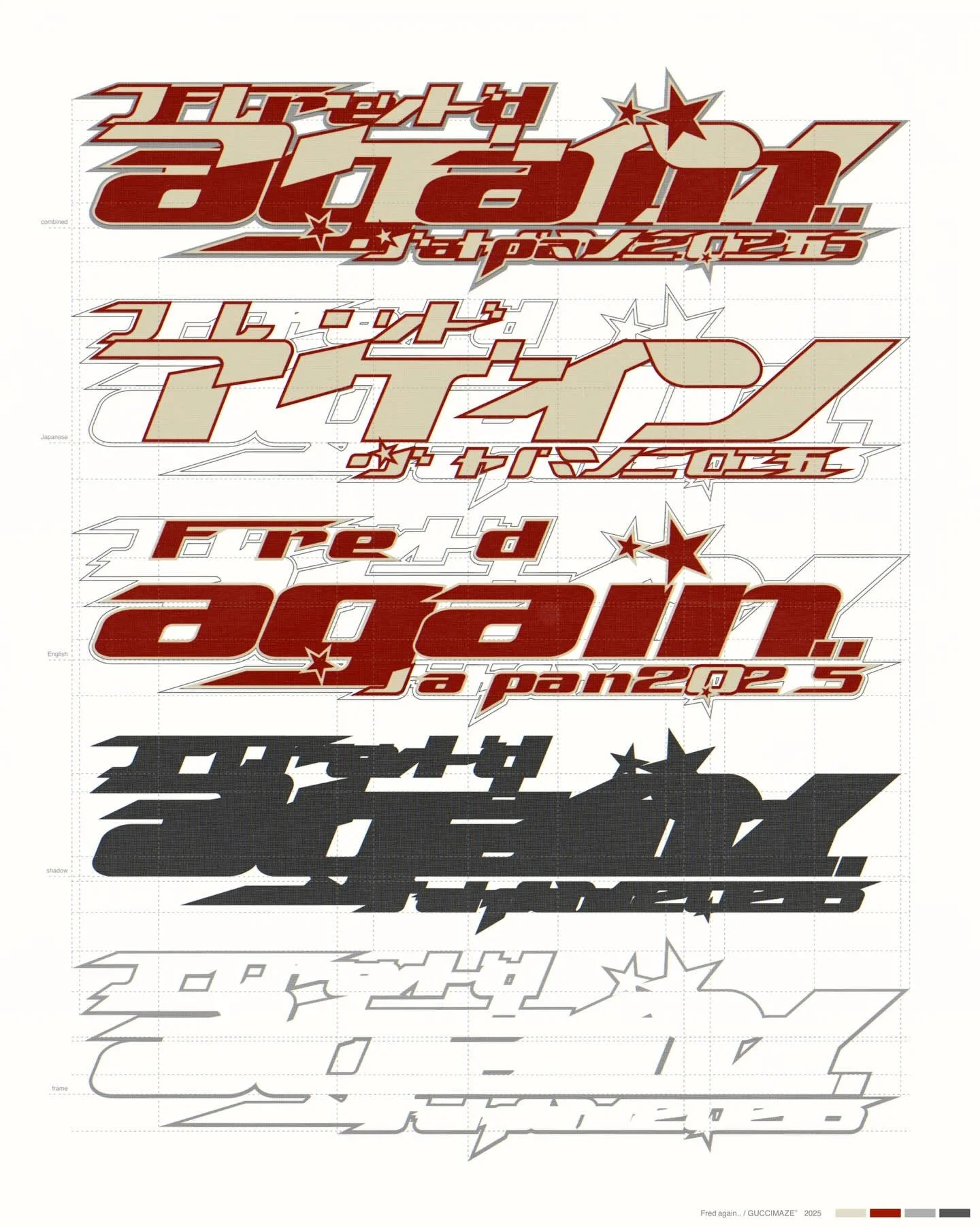
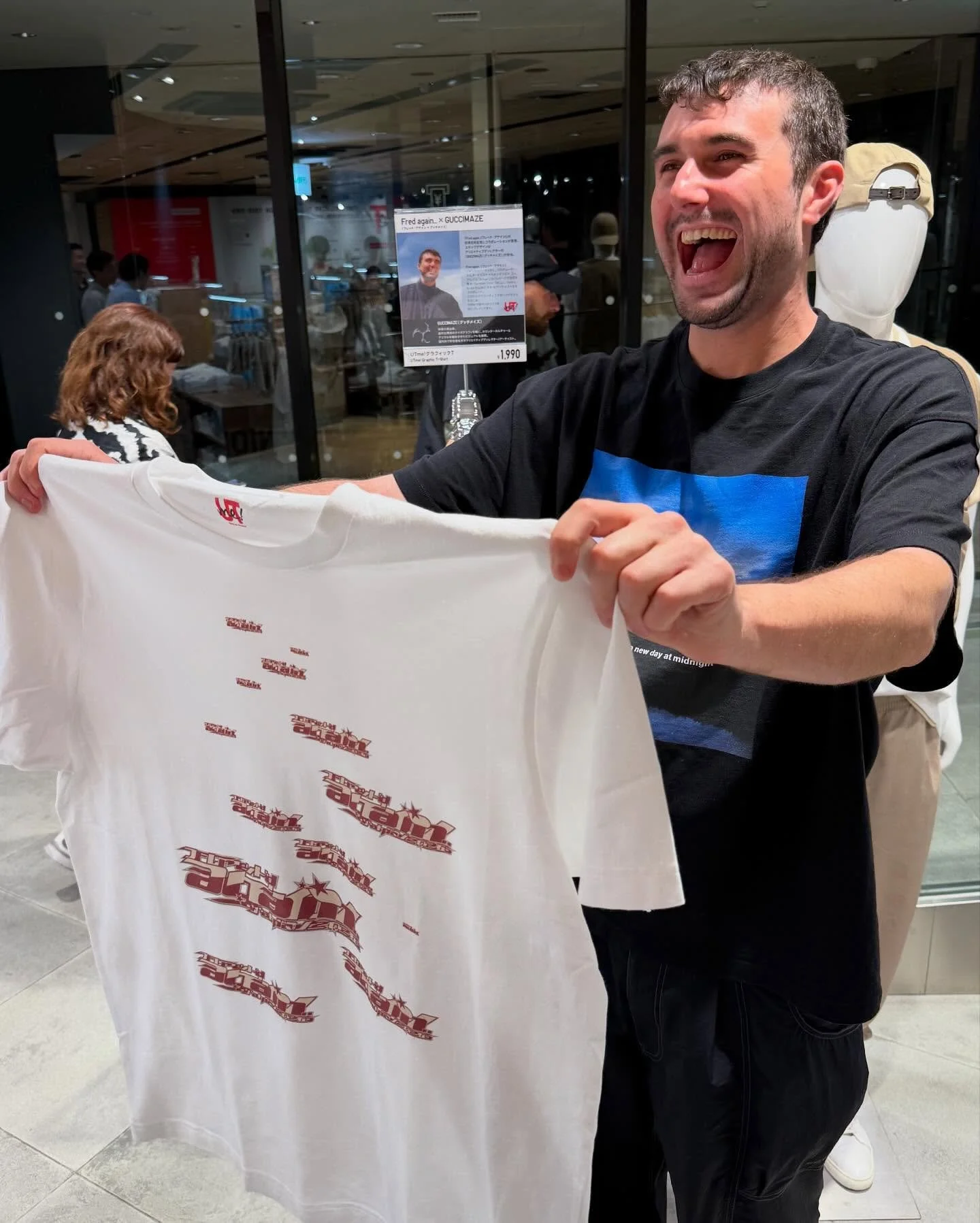
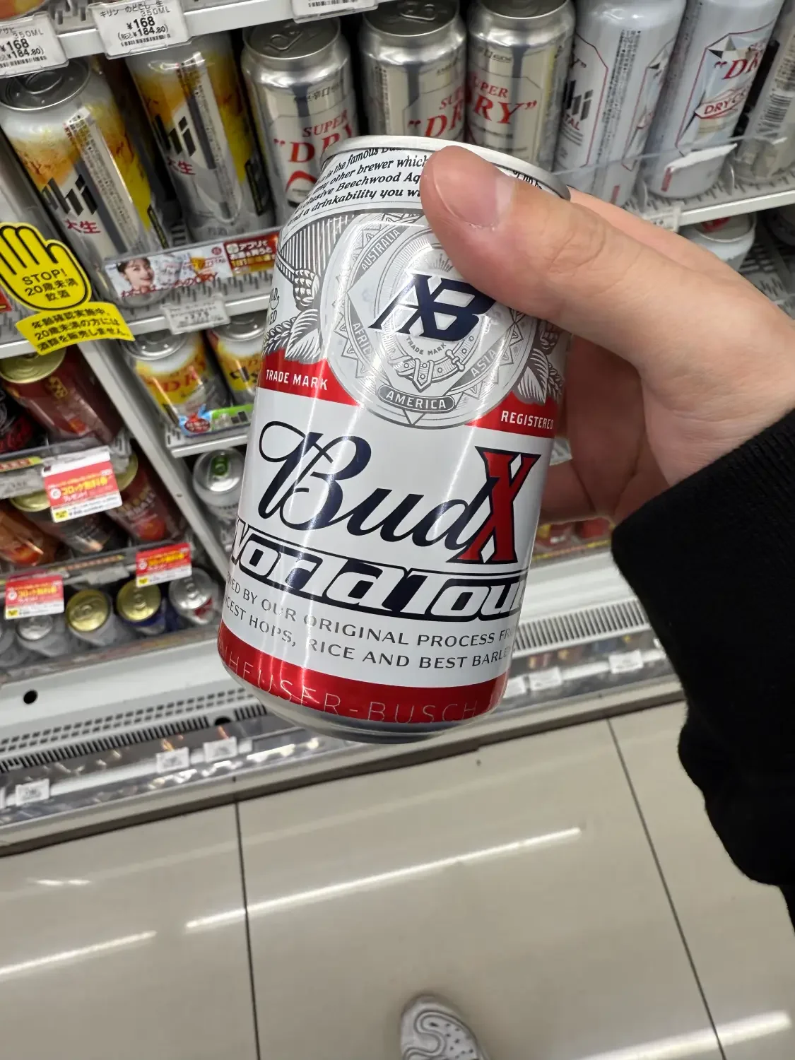
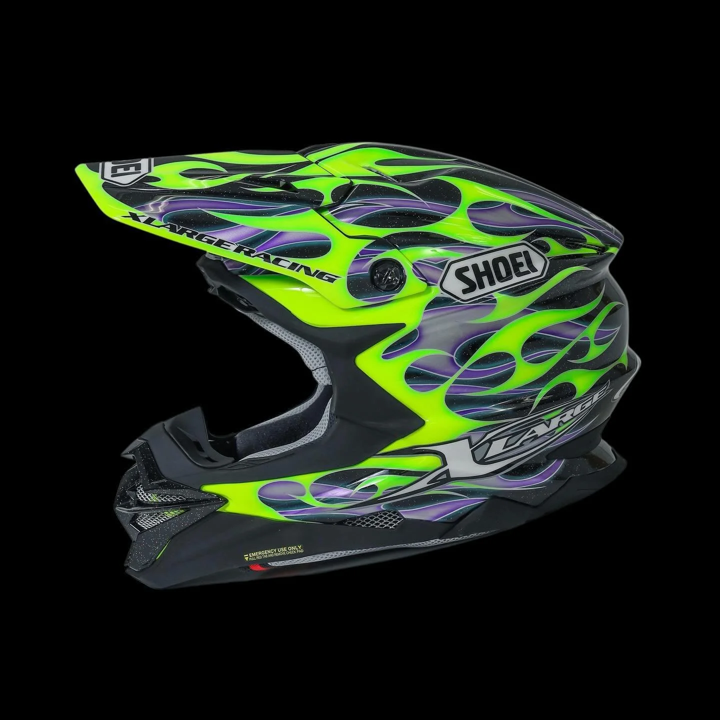
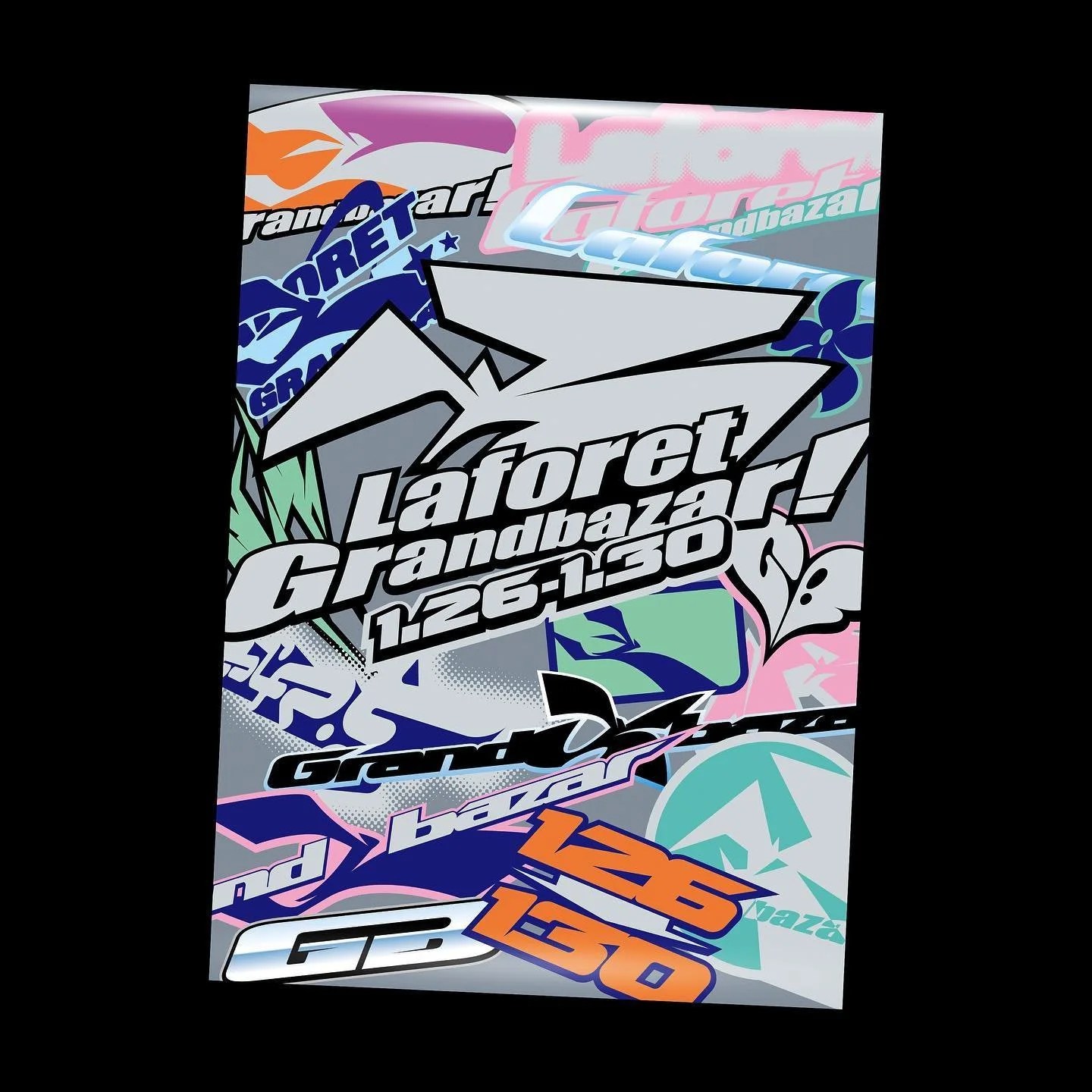
Beyond the gleaming metallic and 3D chrome, GUCCIMAZE’s typography draws anchored on graffiti culture. You’ll see letterforms constructed on the fundamentals of classic Wildstyle, tag handstyles, and spray-can muscle memory. He regularly strips back the chrome entirely to release pure vector typefaces and raw line work that read like modern graffiti burner pieces, even working with airbrush occasionally.
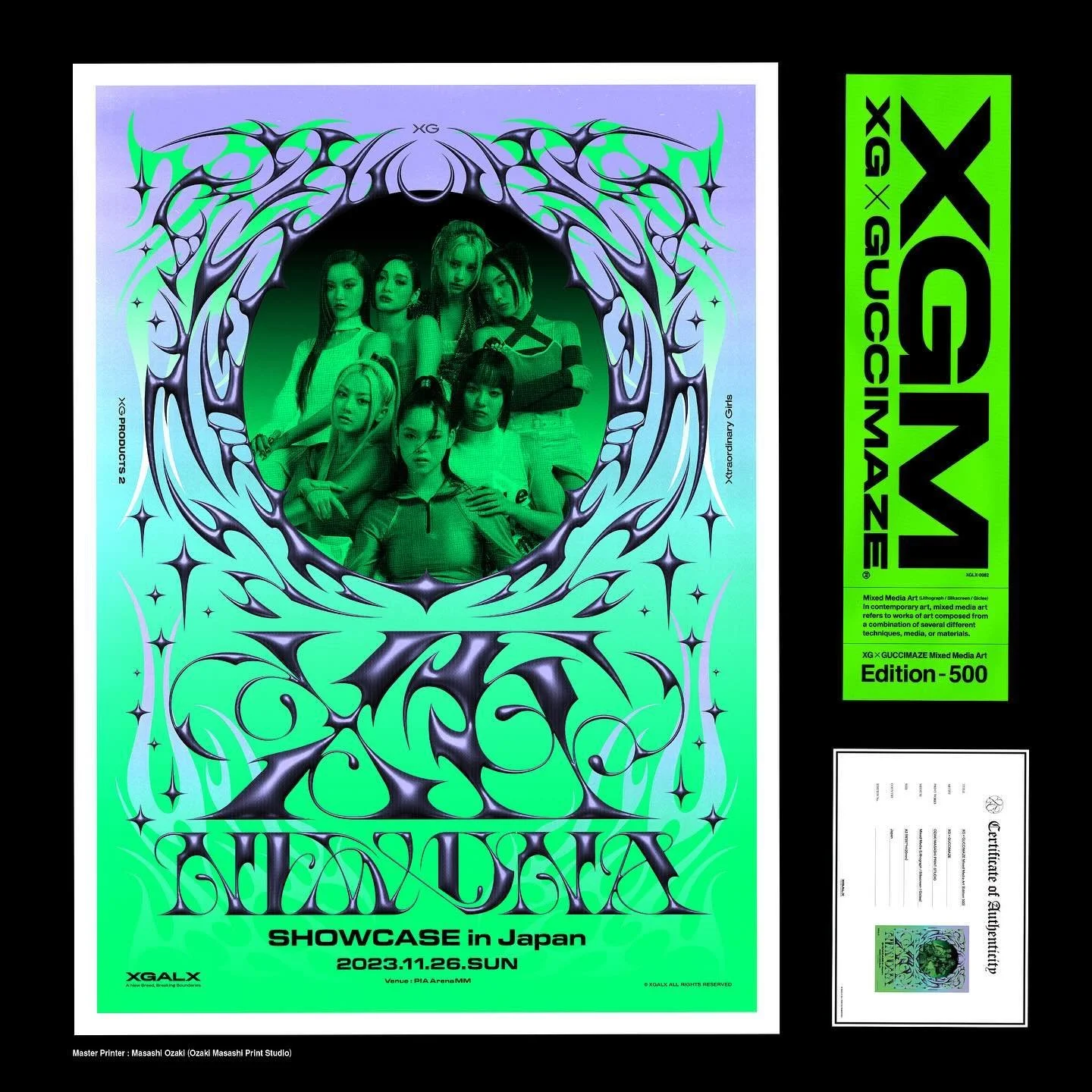
His signature palette, lime green set against black, purple, and blue, still sits at the center of his universe. Scroll through his Instagram feed today and it reads like one continuous, glowing teal-green moodboard. In 2023, he had the opportunity to bring his signature hue to the stage, as he designed neon-drenched merchandise and promo visuals for XG’s first live audience showcase in Japan, NEW DNA. Earlier this year, he revisited the colorway for his Vans collaboration, creating a seemingly straightforward design with hidden features. As the shoes wear down over time, they reveal a hidden neon green layer under the surface (and yes, they glow in the dark).
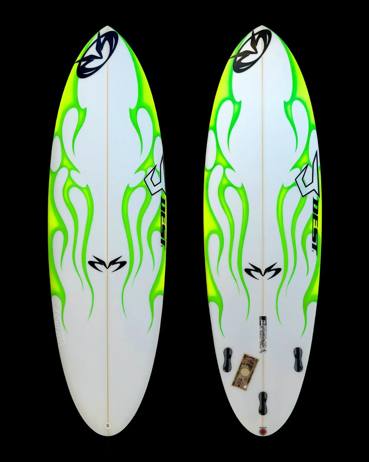
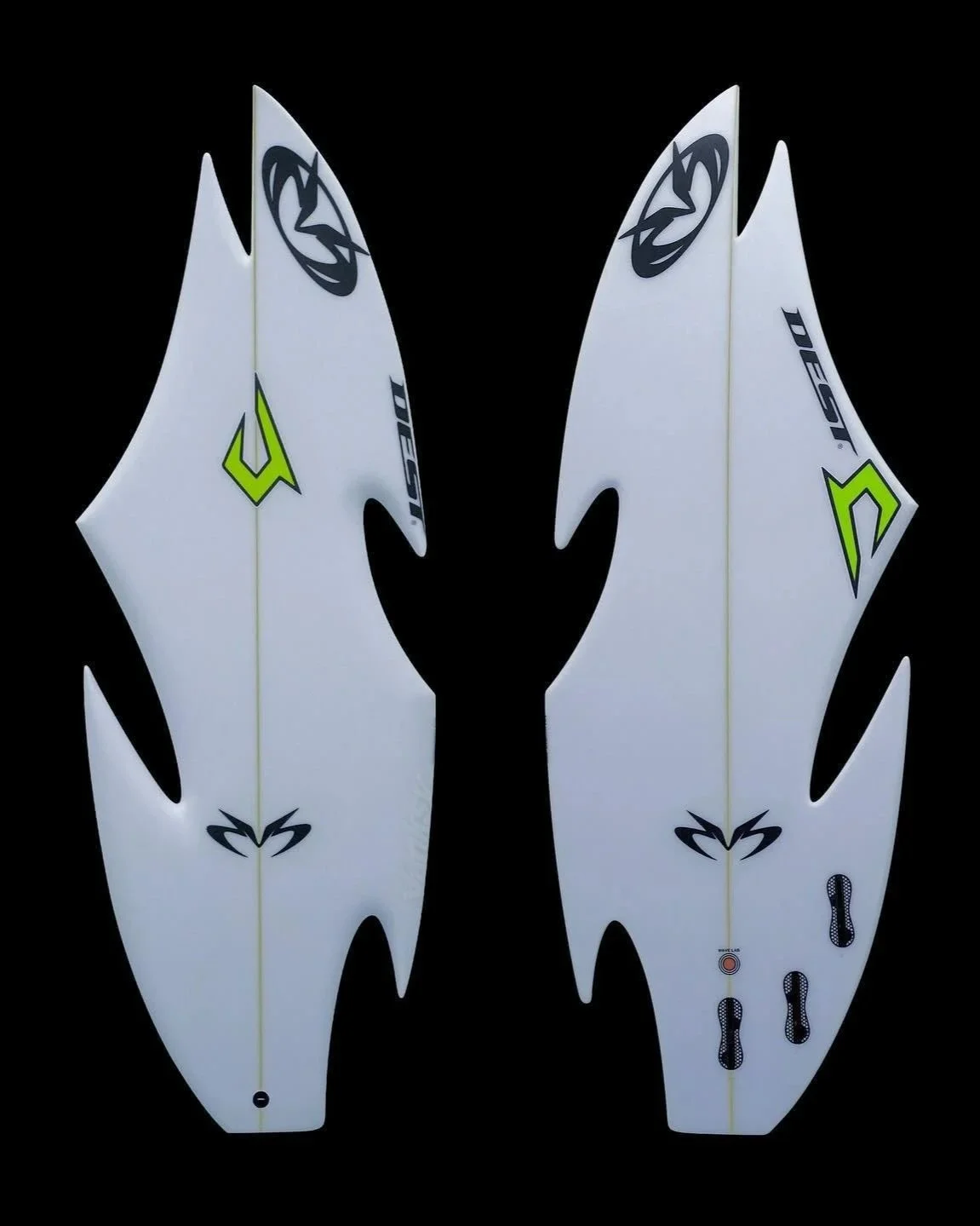
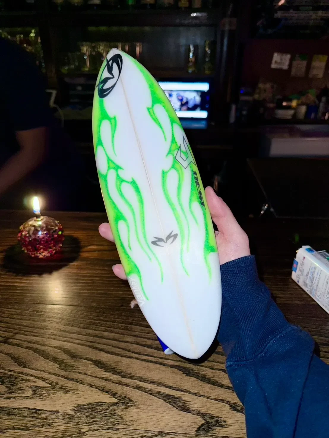
GUCCIMAZE continues to push Chrometype into the physical world. As an homage to his surfing days in Shonan, he teamed up with Justice Surfboard on two custom releases. For his 2023 solo exhibition DEST in Tokyo, he literally carved and reshaped a board into his signature molten flame silhouette, though he admits he has no idea if it’s actually seaworthy. Last year, he reunited with Justice Surfboard for a second iteration, this time keeping the traditional shape intact and draping neon green liquid flames across the entire deck.
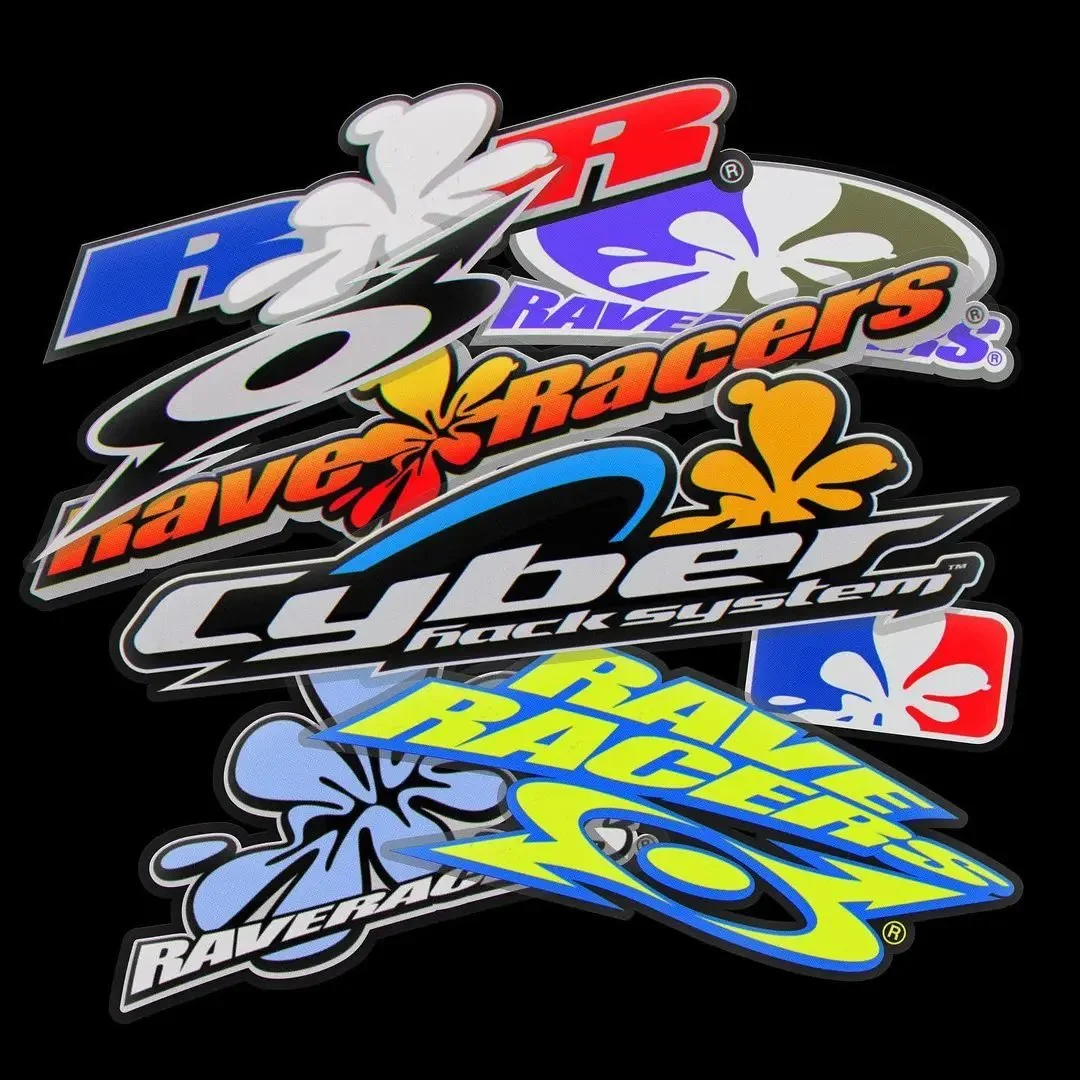
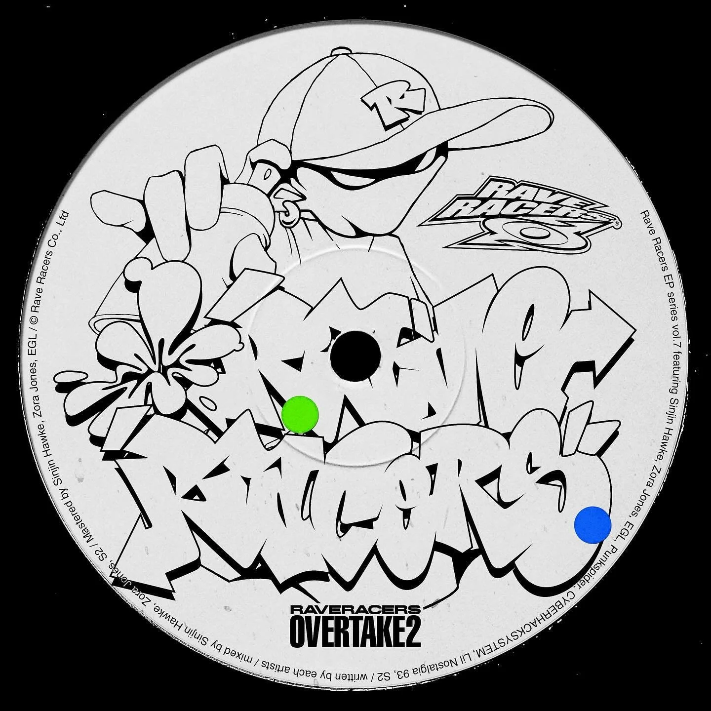
As a core cultural incubator in the city, he also shapes the visual identity of Rave Racers, the Tokyo creative music collective spearheaded by JUBEE. Drawing heavily on '90s and Y2K rave energy, the collective dropped their album Formula-R, with GUCCIMAZE directing the flyers, cover art, and merch design.
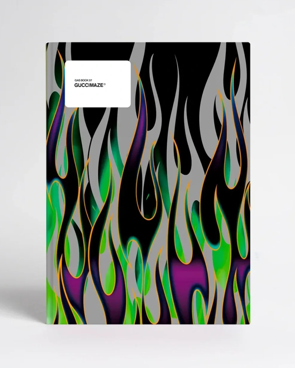
As a major milestone in his creative career, GUCCIMAZE was featured in his very own edition of GASBOOK, the iconic publication series documenting Japan’s most influential artists since 1996. GASBOOK 37 compiles his work between 2018 and 2023, showcasing the full breadth and versatility of his visual output.
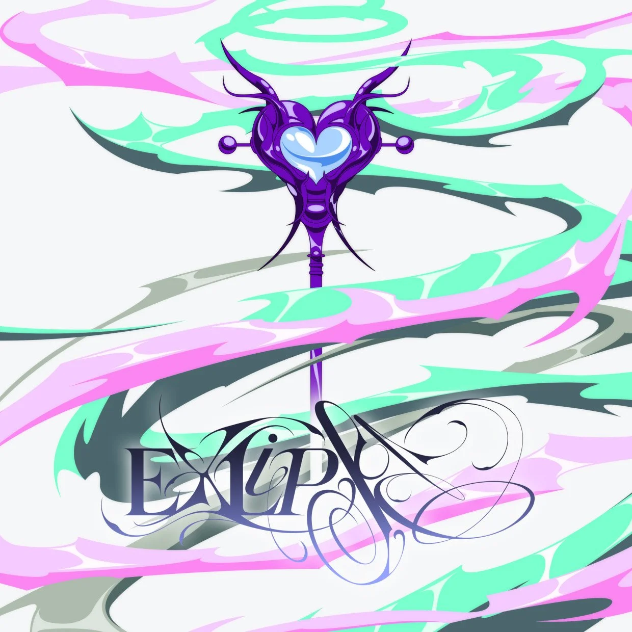
That ongoing crossover into the physical realm continues with his upcoming duo exhibition 「EXLIPSE」alongside nail artist Tomonyan at Osaka’s Shinsaibashi PARCO. Transforming liquid metal into physical art, the pair have crafted a universe of fantasy-world kawaii weaponry. The exhibition will run from November 13 until November 29.
From sneaking out of his parents' house with a single green spray can to translating Shodo brushwork into digital letterforms, GUCCIMAZE has built a design language that remains tethered to street-level craft. With his international background and roots in Tokyo’s nightlife, it's easy to see how deeply GUCCIMAZE’s design influence is impacting not only Tokyo’s creative community, but the global scene at large.
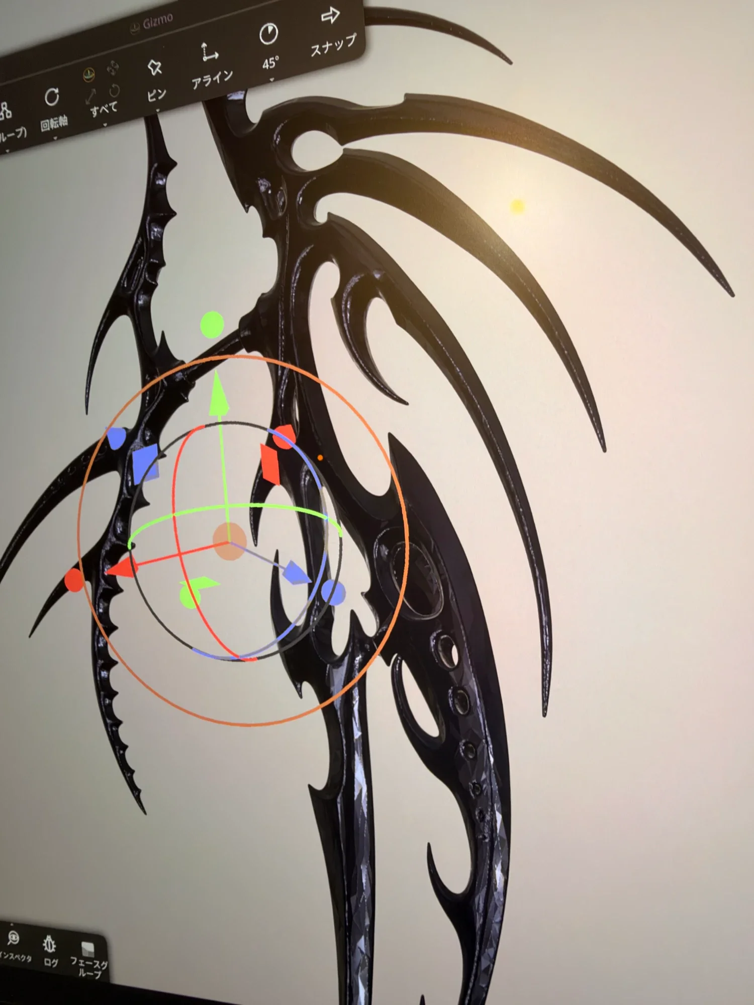
「EXLIPSE」 by GUCCIMAZE® × Tomoya Nakagawa
Venue - Shinsaibashi PARCO
Date - 11/13 - 11/29
Find more details about the EXLIPSE exhibition here or on the event’s Instagram page
Latest articles


Shunpei Kamiya on exploring the familiar, the unsettling, and everything between.